Blizzard has teamed up with ARTtitude to create 48 console controllers for PS4 and Xbox One to celebrate Overwatch’s first anniversary. Each custom controller is handmade, created by European street artists and uniquely numbered. Unfortunately, these dope controllers will not be for sale: instead, fans will have a chance to win these controllers via several contests and giveaways across Europe. The 24 designs represent all 24 of Overwatch’s heroes. That said, some designs are more successful than others.
Here’s a look at the controllers below along with my detailed, unsolicited opinions on each one. Feel free to disagree with me in the comments after you peruse the listing below:
Ana
I was clueless on who this was supposed to be for some reason. Eventually, after eons, a light blinked dimly in my head: Pharah? Pharah wears blue, right? Close, but no cigar. After my feeble mind strained itself a little further, I realized that the blue cloth wrinkles and particular shade of gray wink at the mother, not the daughter. While this controller’s not flashy, I like how subdued it is. It doesn’t necessarily scream “ OVERWATCH FAN HERE!!! ” but is very satisfying if you get the reference.
Bastion
Gotta say, not a fave. Bastion is my baby boi for lyfe, but this interpretation’s a little too on the nose. Plus, the colors are ugly, which is weird, because Bastion is the cutest character in Overwatch. I would have liked something that incorporated Ganymede somehow. Bastion’s short made me look at Ganymede in a whole new way and his influence could have made this whole controller a lot cuter.
D.Va
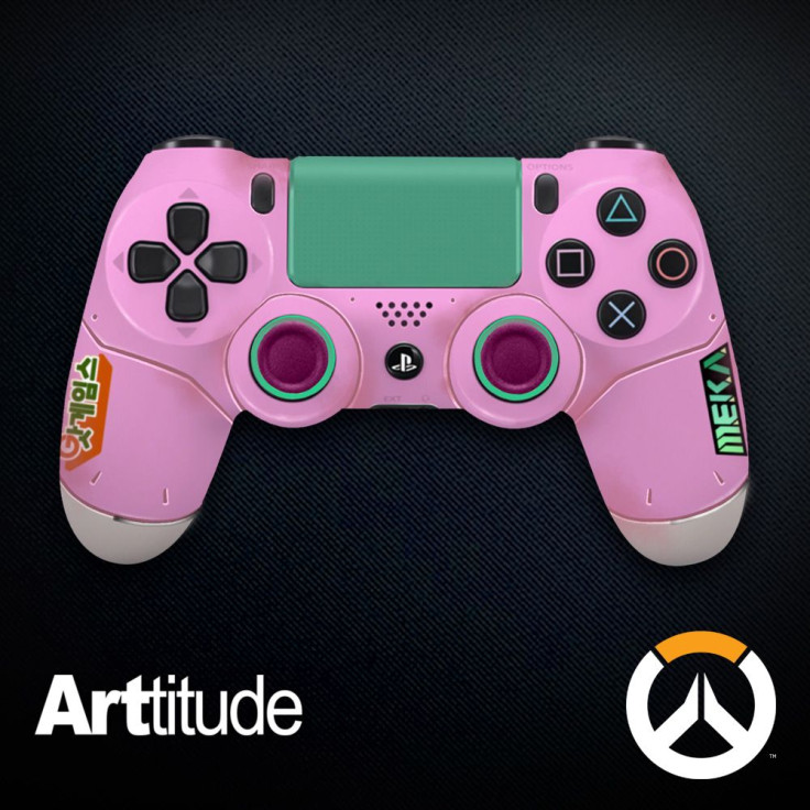
D.Va online! It looks great, thanks to D.Va’s fantastic original palette. The Korean writing and MEKA sticker on the sides of the controller make it very clear that this is a D.Va controller. I also like the use of that bright teal, which is the color of D.Va’s pew-pew. It’s not on D.va’s mech exactly but it’s definitely a familiar color to those who play D.Va a lot. Going with the mech and not D.Va’s bodysuit also kept it from going in a creepy direction.
Genji
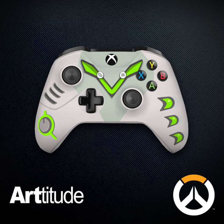
Like, it’s fine, but I feel really weird holding a PlayStation 4 controller with this color scheme. Genji definitely has the color palette of an original XBox, but we all know he defeated the ultimate red ring of death. I guess I’m a little confused on the choice of the three arrowheads on the right. The v of his visor across the top of the controller, I get; the dial/knob things are all over his outfit; but where are those weird little arrow things? Maybe I’m missing something.
Hanzo
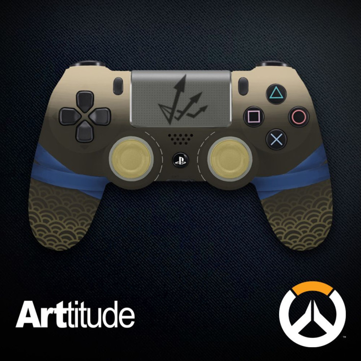
Poor Hanzo gets so much hate already, and I’m just going to add to it. This controller is kind of ugly. The colors are inexplicably dusty and I really don’t like the Scattershot symbol on the touchpad; it’s too obvious. While the Japanese-esque design on the tips of the handles are a cool callback to Hanzo’s origins, and I like the blue ribbons as a welcome touch of color, this design is a miss for me.
Junkrat
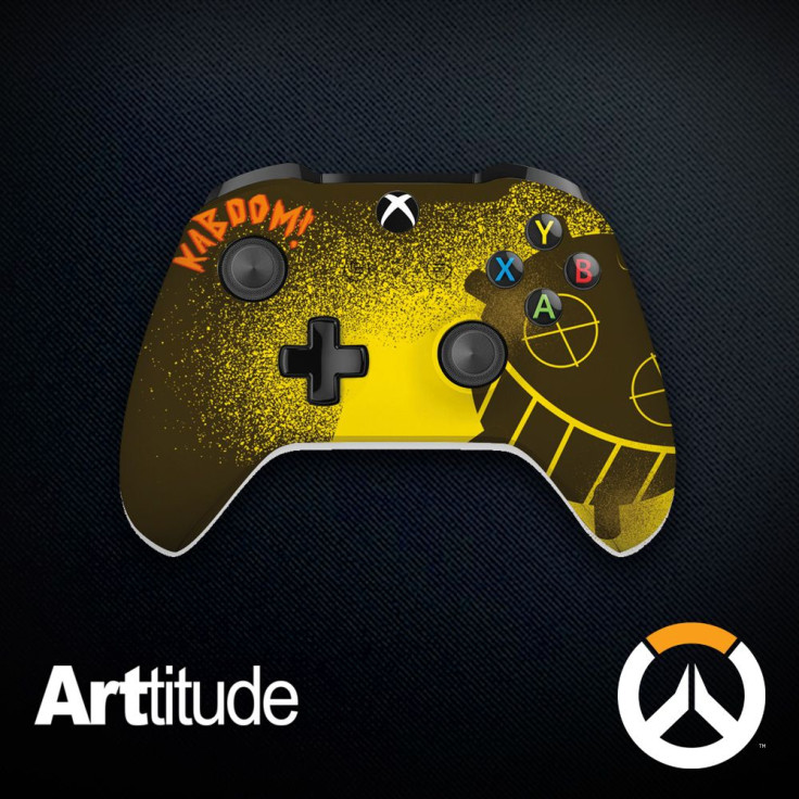
At first I wanted to hate this controller, but the more I looked at it, the more I liked it. The “kaboom!” in jagged orange letters is over-the-top, sure; but then again, so is Junkrat. The face on the side is creepy-cute, kind of like Junkrat. And the gradient effect looks really striking, too.
Lucio

I want to hate the frog icon on the touchpad, because I hated on Hanzo’s Scattershot icon and it’s fair to be consistent, but the frog icon is just so adorable that I can’t. This is instantly recognizable to anyone as Lucio. My only quibble is with the dotted, muted block of color between the bright greens and blues on the handles. Why? Just be bright, baby.
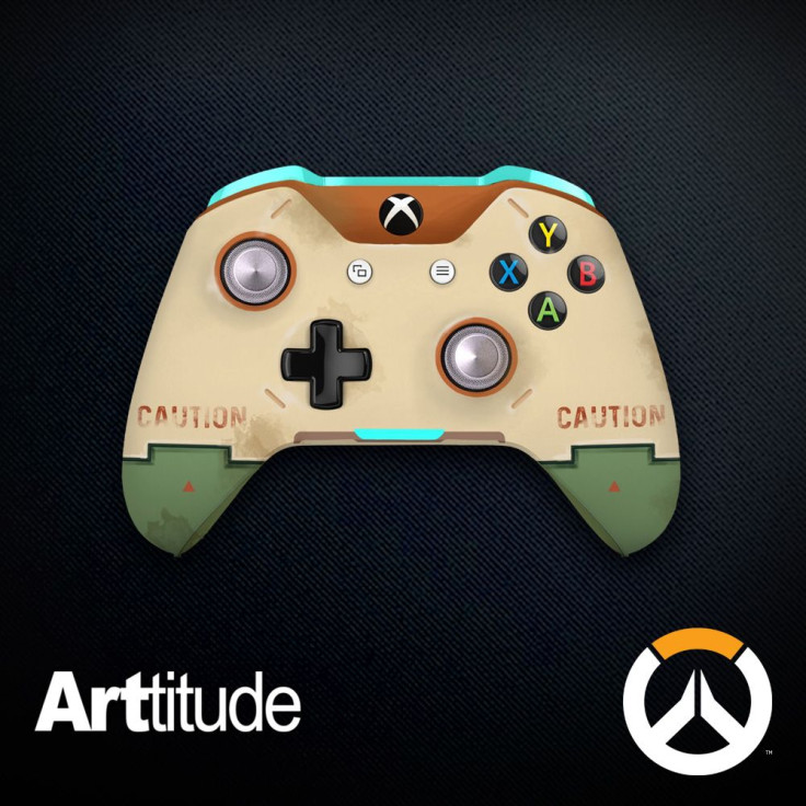
McCree
Oh, this is so ugly. They did you wrong, McCree. Those little holes… that must and dust… and only a peek of the iconic red poncho? I would have preferred a giant “BAMF” over the body of the controller instead of this sad, dusty thing.
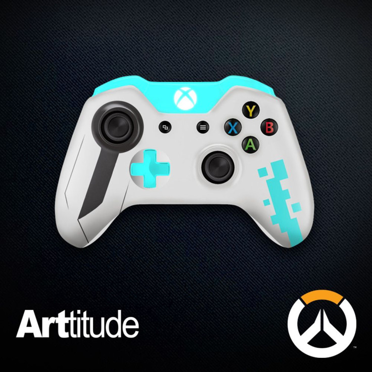
Mei
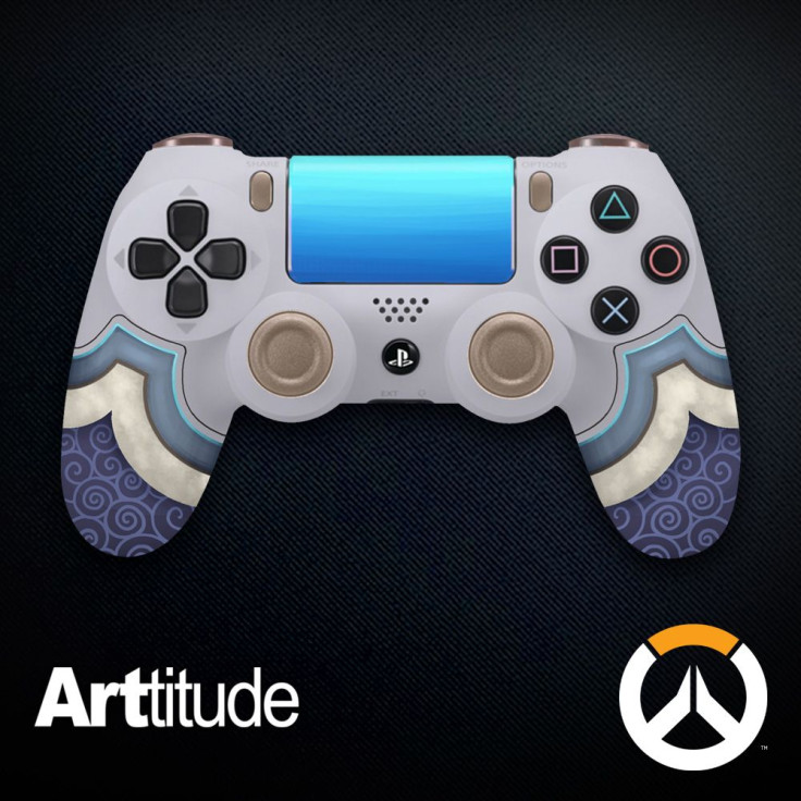
I… I didn’t know who this was supposed to be. In the end, the kinda-Chinese-looking curls on the handle sort of clued me in. I love the controller on its own, actually, especially that deep glacial blue on the touchpad, but this was so subtle that it lost me completely. As for the patterns at the bottom of the handle, are they some Chinese traditional motif I know nothing about? Because as far as I can tell, those patterns aren’t on Mei’s original outfit. I like a subtle nod, but this was too subtle for me. Still a gorgeous controller, though!
Mercy
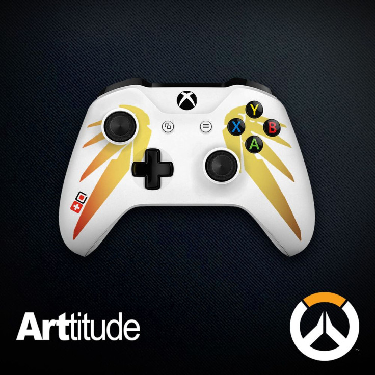
I love this one. Very graphical, very pop-art and bold, very simple and clean. The wings are obviously and immediately Mercy, but if you’re not an Overwatch fan, they could mean anything.
Orisa
Orisa is another graphical, pop-art winner, with bright colors and bold recognizable shapes making it clear who this controller is supposed to represent. The clean design, angled slashes and appealing color-blocking make this controller one of my favorites in the ARTitude bunch.
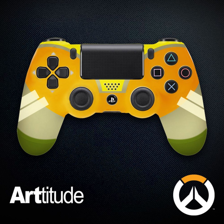
Pharah
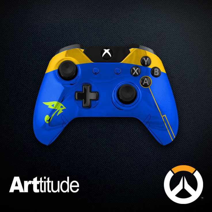
Call me stupid, but I thought this was Lucio at first. Like, I thought the little green eye was supposed to be a frog, and blue and green are Lucio’s colors, so…. Then I realized that the bright golden yellow and eye-searing royal blue was meant to refer to Pharah, not Lucio. My bad. I don’t like this controller anyway because I don’t get why the Horus eye thing is green, and what’s the point of the little thin line down from the A/X button? Even with the specific iconography they used, I still didn’t get it right away. I don’t know if that’s on me or on ARTitude. Half-and-half?
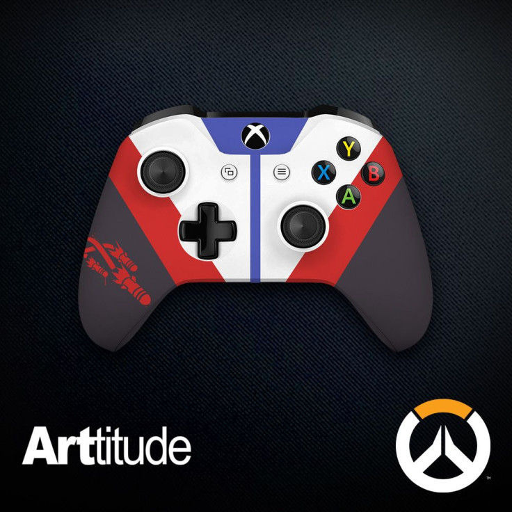
Reaper
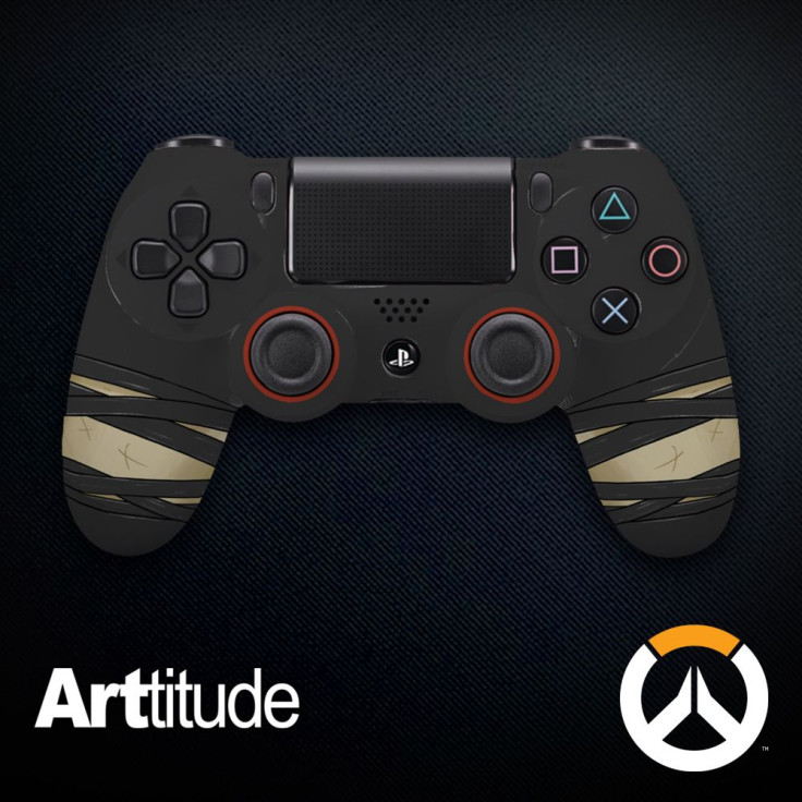
I was lost on this. Lost, lost, lost. “Could it be a reference to Tracer’s punk costume?” I asked myself in bafflement. “Maybe it’s Widowmaker, because she’s refined and elegant, like these ballet slipper ties on the handles.” I blew the photo up to full-size, and then I saw the scar marks on the ashen color between the criss-crossed ribbon ties. Oh , I realized. It’s Reaper . But unlike Reaper, this design is somehow both feminine and delicate in a very Goth way. At least they worked in a hint of his devilish red accent color around the joysticks. I’m still annoyed to see that Bioware officially thinks a black man turns white when he comes back from the dead, but some people have war in their countries so I’ll quit flogging this dead horse. (For now.)
Reinhardt
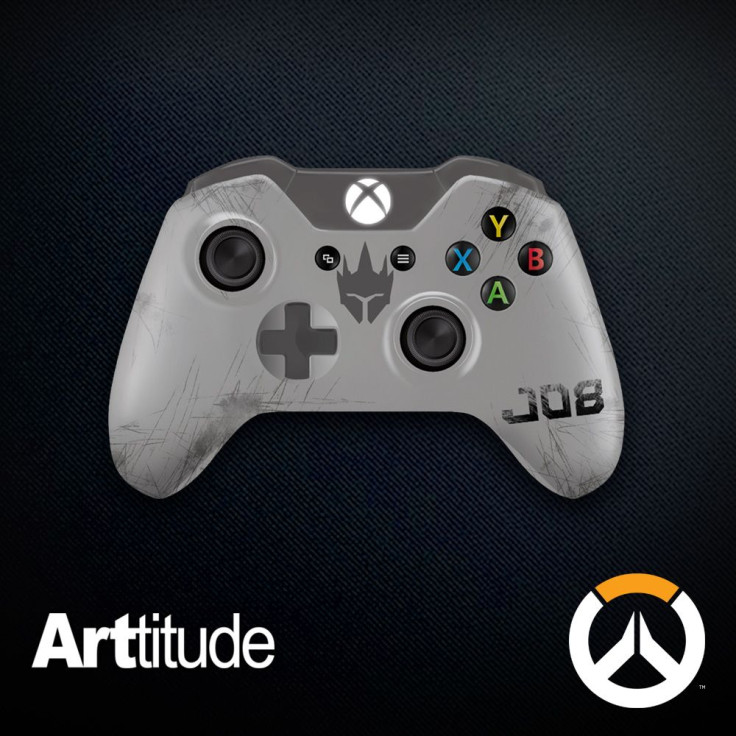
This is as bad as McCree’s! I’m crying for poor Reinhardt, whose bravery, kindness and good humor deserve more than this patch job. It literally says “JOB” on the side, like, what? And it has his head emblazoned on it? Is Reinhardt so hard to make a controller for that you literally have to put his icon on it for people to understand that it’s him? The scuffed gray design is kind of cool, but the icon and text really ruin it.
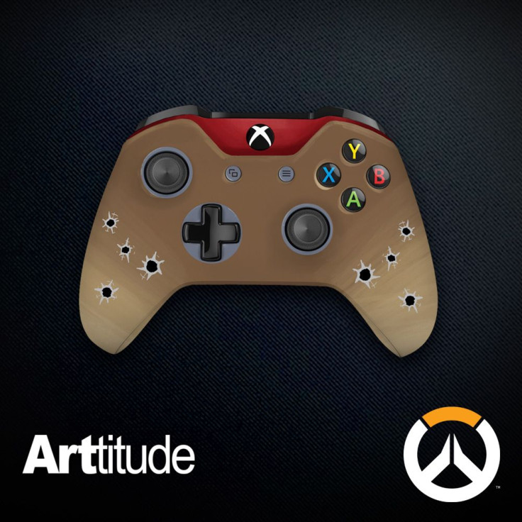
Roadhog, I Guess
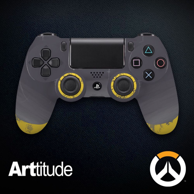
Probably the worst. Nothing about this really screams Roadhog except for the fact that all of the other controllers are someone else. A giant man with a love of pigs and a gas mask, and this was the best we could do for him? Some faded yellows on a gray body? Couldn’t play with his tattoo, or his hook, or his gas mask? Sorry, Roadhog mains. This is so lackluster it's egregious.
Soldier
Well, what else were they supposed to do, I guess. This is very straightforward, just like Soldier. Without the little helix rockets on the side, I’d at least respect this, if not like it. (My favorite part of Soldier’s outfit is his visor; the jacket is not my favorite piece of Overwatch canon clothing.) But the helix rockets, which I thought were a blood splatter when the image was small, push this from over-the-top to in-your-face. At least it’s not Roadhog’s, though.
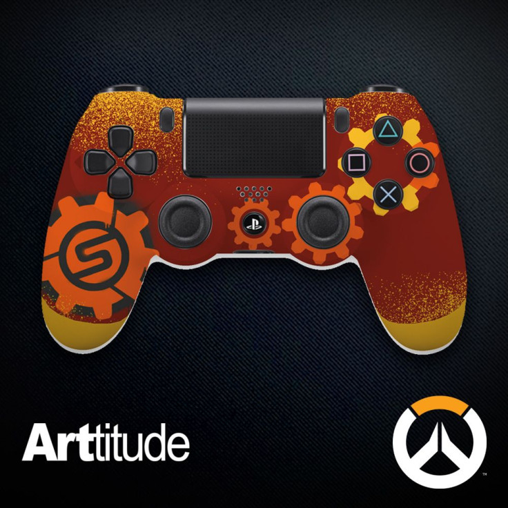
Sombra
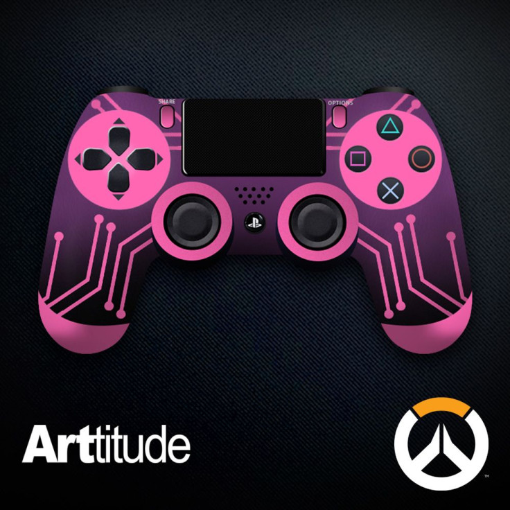
Perfect. Godly. Amazing. Instantly recognizable due to the color scheme and circuit board motif as our favorite Mexican hacker goddess, without having to stamp “SOMBRA” on it or use her skull icon on the touchpad or any lazy shortcuts like that. This is definitely one of my favorites.
Symmetra
I have such a soft spot for Symmetra, and they didn’t do her too dirty in this one. The bright electric robin’s egg blue against the white controller is gorgeous and striking, and I’m not mad at the bold gray stripe and thin gray lines emanating from the left-hand joystick.
Torbjorn
I love the gradient effect, and the gears make it very easy to tell who this is intended to represent. I don’t know how I feel about the giant Molten Core icon on the left-hand side. As a rule, I don’t like seeing ability icons because it just feels too fannish and obvious, but the size of this gear balances out all the little gears on the other side. At the end of the day, I’m not a Torbjorn fan, so I don’t want to think about it much further.
Tracer
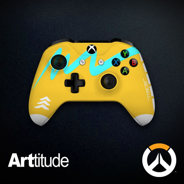
Considering the first thing you think when you think of Tracer is her chronal accelerator in that iconic blue color, it’s a little baffling to make the body of the controller that ugly mustard-yellow. Tracer’s tights are yellow, but they also have a cool gradient into orange towards the bottom, which would have been very cool to incorporate. I’m not mad at the idea of that blue squiggle along the front because it’s very bold and visually appealing, but they put both her name and an ability icon on the controller. Why? Tracer’s iconic without literally using her icons. There’s promise here that wasn’t fully carried out.
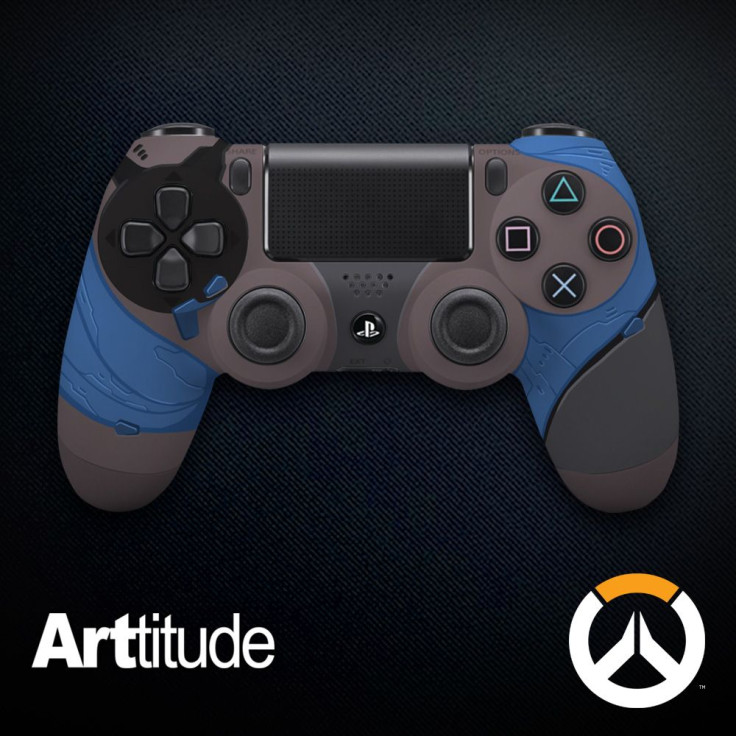
Widowmaker
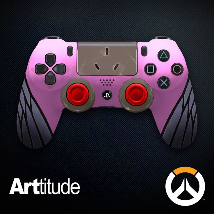
Once I saw this controller, I was able to rule out Reaper’s ballerina-shoe controller as a possible Widowmaker reference. From the red joysticks to the pink body color and webbed silver controllers, this is as clear a reference to Widowmaker’s outfit as you can possibly make. It’s not the most creative thing on Earth, but it’s successful.
Winston
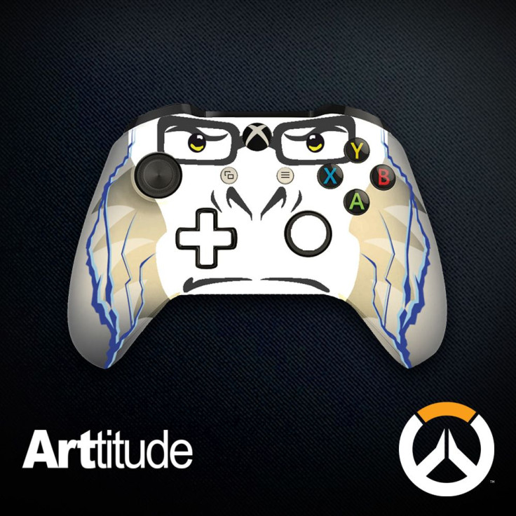
I laughed, but not in a good way. Is Winston so hard to design for that you literally have to slap his face on the controller? Bad, bad, bad. This looks childish.
Zarya
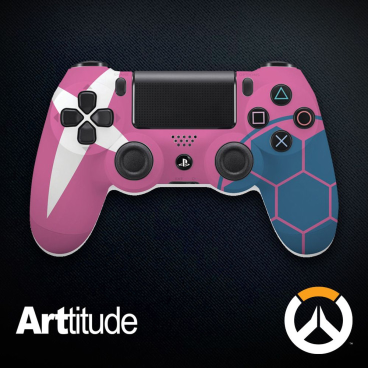
Like in Torbjorn’s case, this is one of the few instances in which I actually like an ability icon’s usage. The bubble shield icon genuinely feels like an important design element and not like a lazy shorthand to make it clear which character is being referenced. I also love the white splash of Zarya’s eye scar on the other side of the controller and the pink body color is a great reference to Zarya’s famous hair color. This is really well-executed and looks amazing.
Zenyatta
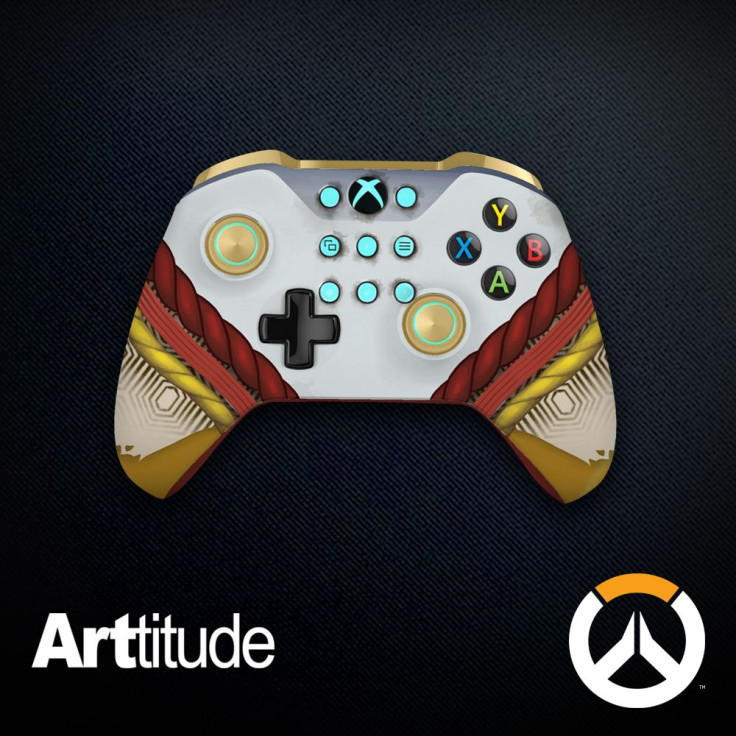
I was hoping for something more creative for Zenyatta than a rehash of his costume. I do love the teal blue dots and how they’re incorporated on the front of the controller, just like the dots on Zenyatta’s head. The joysticks looking like Zenyatta’s orbs is another nice touch. But it becomes too literal for me with the inclusion of the braided red and yellow ropes.
What do you think of the ARTitude Overwatch anniversary controllers? Which one would you buy if you could? What designs need to be revisited? Inb4 console pleb? Feel free to let us know in the comments section below.
- Amazing Art Style
- Balanced Mechanics
- Characters Keep You Coming Back For More
- No Single Player
- Overwhelming At First