

Star Trek: Discovery will get more vivid as the events of the series approach the timeline of Star Trek: The Original Series, slowly mirroring more of the show’s iconic psychedelic color scheme, Discovery ’s Lead Motion Graphic Designer Timothy Peel told an audience at FanExpo Canada, TrekMovie reports.
What we’ve seen of Star Trek: Discovery sets — including the command bridges of two starships, crew quarters and corridors — are overwhelmingly industrial-looking in design and primarily comprised of two colors: gray and what Peel described as “slightly blue-y.” Peel’s work on the various display screens can be seen in the background:

Slightly blue-y indeed. But Peel says that will change over the course of the show. “They are sort of restricting all the color schemes and they will slowly advance and become more colorful as we get closer to The Original Series, and for other reasons I can’t repeat.”
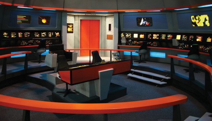
Star Trek: Discovery is set in the year 2255, approximately ten years before the Enterprise’s five-year mission portrayed in Star Trek: The Original Series. Where DSC is blue and gray, TOS is vermillion, purple, powder blue, neon pink, orange and bright green.
Star Trek: The Original Series premiered in 1966 in the midst of a broadcast battle, not just for viewership, but to grab the up-market color TV viewers. Of 55 million television-owning households, only 9.5 million were watching color sets. But it was an exploding chunk of the market, with color sets jumping in sales more than 80% from 1966-1967.
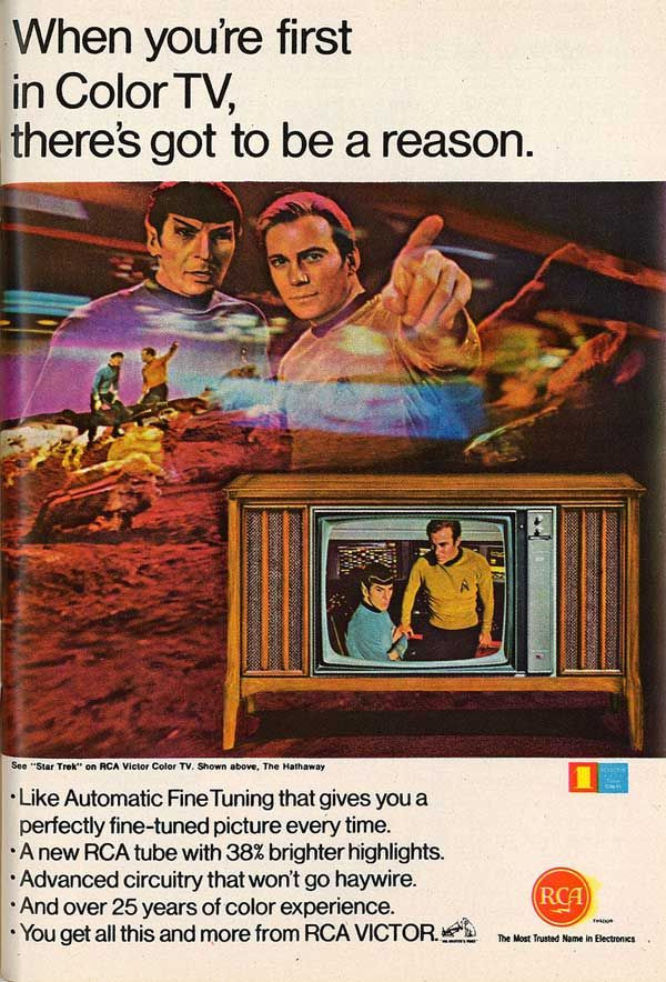
Marketing itself as the “full color network,” NBC offered color programming in concert with parent company RCA, which sold color televisions. RCA ad campaigns prominently featured the colorful Star Trek , like this 1967 ad selling “38% brighter highlights” and “Automatic Fine Tuning” with the help of Kirk and Spock:
Despite mediocre ratings — Star Trek’s viewership made it only the 57th most-watched show in its first season — color may have been one of the reasons Star Trek survived for 79 episodes. Herbert F. Solow, Star Trek ’s executive in charge of production, cited high ratings among color TV audiences as a key reason Star Trek was renewed for a second season in his 1996 tell-all, Inside Star Trek: The Real Story. (Star Trek Fact Check investigated Solow’s claims in-depth)
Bright colors are no longer so fundamental to TV aesthetics, with many sci-fi shows opting for Apple white (The Orville) or industrial (The Expanse) looks. Adopting more and more color could help Star Trek: Discovery stand apart, aligning it more with the current crop of sci-fi movies, like the hyper-colorful Guardians of the Galaxy Vol. 2. It’s still a mystery how this transition will take place in the show, but it’s nice to hear the production design team has given some serious consideration to reconciling the two series portraying roughly the same period in the Star Trek future, but filmed 50 years apart in radically different aesthetic eras.


